The Power of Spot Colors: A Comprehensive Guide to Color Consistency in Global Branding
The Power of Spot Colors: A Comprehensive Guide to Color Consistency in Global Branding
In today's visually saturated world, color consistency isn't just a luxury—it's a fundamental necessity for brands that want to maintain their identity across the globe. Have you ever wondered how companies like Coca-Cola, Tiffany & Co., or Chanel ensure their signature colors look exactly the same, whether you're shopping in New York or Tokyo? The answer lies in a sophisticated color technology called spot colors, a system that has revolutionized the way brands maintain their visual identity worldwide.
Understanding the Foundations of Spot Colors
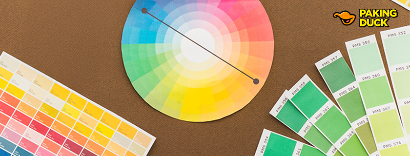
Imagine having a precise recipe book for colors—one that guarantees the exact same result every time, anywhere in the world. That's essentially what spot colors are: standardized, pre-mixed colors that ensure absolute consistency in printing and brand representation. Unlike the traditional CMYK printing process, which combines four basic colors to create various shades, spot colors are custom-mixed ink colors that are specifically formulated to achieve exact color matches.
The concept of spot colors emerged from a crucial need in the printing and manufacturing industries. As businesses began expanding globally in the mid-20th century, they faced a significant challenge: maintaining consistent brand colors across different printing facilities, materials, and geographical locations. This challenge led to the development of standardized color systems that would eventually revolutionize global brand management.
The Evolution of Color Standardization
The Birth of Modern Color Management
The journey toward standardized color management began in the 1950s when Lawrence Herbert, who would later transform the Pantone company, recognized the printing industry's struggle with color matching. The challenge wasn't just about creating colors—it was about creating a system that could reproduce exact colors consistently, anywhere in the world.
The Rise of Pantone
Pantone emerged as the supreme authority in color standardization, developing a comprehensive color matching system that would become the global standard. Their innovation went beyond simply naming colors—they created a precise methodology for color creation and matching that could be replicated with perfect accuracy across different mediums and locations.
The Pantone Matching System (PMS) works like a sophisticated color recipe book. Each color in the system has its own unique identification number and formula, ensuring that when a specific Pantone color is chosen, it can be perfectly replicated anywhere on the planet. This system has become so integral to global business that designers, manufacturers, and brands worldwide speak in "Pantone numbers" when discussing colors.
The Science Behind Spot Colors
Chemical Composition and Color Stability
Spot colors are created through precise chemical formulations. Unlike process colors (CMYK) that rely on layering different percentages of four basic colors, spot colors are mixed as single inks with specific pigments and binding agents. This chemical precision ensures several advantages:
- Consistent color appearance across different printing surfaces
- Enhanced color stability over time
- Better resistance to environmental factors
- More accurate color reproduction in challenging shades
Color Measurement and Quality Control
Modern spot color production involves sophisticated measurement tools and processes:
Spectrophotometers measure the exact wavelengths of light reflected by colors, ensuring precise matching. Delta E measurements quantify the difference between two colors, helping maintain strict quality control standards. Computer-controlled mixing systems ensure exact proportions in ink formulation.
The Impact on Global Brand Management
Building Brand Recognition Through Color
Research has shown that color increases brand recognition by up to 80%. This statistic becomes even more significant when considering global markets, where consistent brand representation across different cultures and contexts is crucial.
Case Studies in Color Consistency
Tiffany & Co.'s Iconic Blue
The famous Tiffany Blue box represents one of the most successful applications of spot color in brand identity. This distinctive blue-green shade (Pantone 1837) is so precisely maintained that it has become a registered trademark. The color's consistency across all Tiffany & Co. materials, from packaging to advertising, has helped build a brand value estimated at billions of dollars.
Coca-Cola's Global Red
Coca-Cola's signature red (Pantone 484) appears identical on every product worldwide. This consistency has helped make the Coca-Cola brand instantly recognizable across different cultures and languages, contributing to its position as one of the world's most valuable brands.
McDonald's Golden Arches
The McDonald's yellow (Pantone 123) used in their iconic golden arches demonstrates how spot colors can maintain consistency even in outdoor signage exposed to different weather conditions and lighting environments.
Technical Aspects of Spot Color Printing
The Limitations of Process Color Printing
Traditional CMYK printing faces several challenges:
Color Gamut Restrictions: CMYK can only reproduce a limited range of colors compared to spot colors. Registration Issues: Multiple color plates must align perfectly to create the desired color. Color Variation: Slight differences in ink density or paper stock can affect the final color appearance.
Advantages of Spot Color Technology
Spot colors overcome these limitations through:
Single-Ink Application: Colors are pre-mixed rather than created through layer combination. Precise Color Matching: Each color is exactly formulated according to standardized recipes. Consistent Results: Colors remain stable across different printing conditions and materials.
Digital Integration and Modern Applications
Bridging Print and Digital
Modern color management systems are evolving to maintain consistency across both physical and digital mediums. This integration includes:
Digital Color Profiles: Specialized profiles ensure consistent color representation across different screens and devices. Color Management Software: Advanced tools help maintain color accuracy throughout the design and production process. Cross-Platform Compatibility: Systems that ensure color consistency across print, web, and mobile applications.
Emerging Technologies in Color Management
New developments continue to enhance spot color capabilities:
Spectral Color Prediction: Advanced algorithms that can predict color appearance under different lighting conditions. Artificial Intelligence: Machine learning systems that optimize color matching across different materials and printing conditions. Digital Color Libraries: Cloud-based systems that ensure global access to standardized color information.
Industry-Specific Applications
Fashion and Textile Industry
The fashion industry relies heavily on spot colors for:
Collection Development: Ensuring consistent colors across different fabric types and materials. Global Manufacturing: Maintaining color accuracy in production facilities worldwide. Brand Identity: Creating and maintaining signature colors for fashion houses.
Packaging Industry
Spot colors are crucial in packaging for:
Brand Recognition: Creating instantly recognizable products on store shelves. Quality Assurance: Maintaining consistent appearance across different packaging materials. Regulatory Compliance: Meeting color-coding requirements for different markets.
Automotive Industry
Car manufacturers use spot colors to:
Maintain Brand Identity: Ensuring consistent color across different vehicle models and materials. Quality Control: Matching colors across different body panels and components. Custom Colors: Creating and maintaining signature vehicle colors.
The Future of Color Standardization
Emerging Trends
Several developments are shaping the future of spot colors:
Sustainable Inks: Environment-friendly formulations that maintain color accuracy. Digital Integration: Enhanced systems for maintaining color consistency across physical and digital platforms. Smart Color Management: IoT-enabled systems for real-time color monitoring and adjustment.
Challenges and Opportunities
The industry continues to address:
New Material Development: Creating consistent colors for innovative materials and surfaces.
Digital Transformation: Maintaining color accuracy in an increasingly digital world.
Sustainability Requirements: Meeting environmental standards while maintaining color quality.
Conclusion
The evolution of spot colors from a practical printing solution to a cornerstone of global brand identity demonstrates their enduring significance in modern business. As color consistency continues to drive brand recognition and trust, spot colors remain the gold standard for maintaining visual integrity across global markets. Their precise formulation and standardized implementation ensure that iconic brands maintain their distinctive identity, making them an indispensable tool in the modern brand landscape.