The Art of Disruption: Oatly's Revolutionary Packaging Design
Rethinking Packaging: Oatly’s Bold Disruption
In the fast-moving world of consumer packaged goods (CPG), few brands have disrupted the status quo like Oatly.
Once a niche oat milk producer, the Swedish company is now a billion-dollar powerhouse, proving that packaging isn’t just about aesthetics—it’s a game-changing business strategy.
By turning packaging into a storytelling tool, Oatly didn’t just refresh its brand; it reshaped the plant-based beverage industry. This deep dive explores how their radical approach set new standards for brand identity, consumer engagement, and category leadership.
The Early Days: When Alternative Milk Played It Safe
In the 1990s, plant-based milk brands like Rice Dream, Pacific Foods, and Silk mimicked conventional dairy packaging—playing it safe with standard cartons, traditional fonts, and neutral color schemes.
Oatly initially followed suit. Their original packaging blended in rather than stood out, failing to communicate their unique identity or mission.
The 2014 Breakthrough: A Total Brand Overhaul
Everything changed in 2014 when Toni Petersson became CEO.
Petersson saw that true disruption required more than just a great product—it demanded a bold, unconventional brand identity. Oatly underwent a radical rebranding, transforming its packaging into an engaging, educational, and entertaining experience for consumers.
The Key Elements of Oatly’s Revolutionary Design
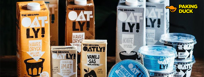
1. Typography That Talks
Oatly’s custom, hand-drawn typography broke away from industry norms, creating instant brand recognition.
- Conversational Copy: Playful, direct headlines like “WOW! NO COW!” and “IT’S LIKE MILK, BUT MADE FOR HUMANS” replaced traditional product descriptions.
- Handcrafted Aesthetic: Variations in line weight and spacing made the text feel raw, human, and personal.
- Optimized Readability: Despite its unconventional style, the typography was carefully designed for legibility across different package sizes.
This bold approach turned Oatly’s packaging into more than just a container—it became a conversation starter.
2. A Color Palette That Commands Attention
Instead of the conventional white-and-blue dairy-inspired palette, Oatly introduced a bold, signature color scheme:
- Light Blue (RGB: 171, 206, 226): The primary brand color for instant recognition.
- Earthy Browns & Vibrant Greens: Used to differentiate flavors and organic variants.
- Intentional White Space: Enhancing premium positioning and making key messages pop.
By using high-contrast color blocking, Oatly ensured that its cartons stood out in crowded store aisles.
3. Breaking Packaging Conventions with Layout & Structure
Oatly abandoned traditional packaging hierarchy, introducing:
- Asymmetrical layouts that grabbed attention on the shelf.
- Layered text elements that turned every panel into an extension of their brand voice.
- Strategic placement of key messages to optimize visibility in retail environments.
This approach made every Oatly carton feel more like a magazine cover than a standard product package.
The Ripple Effect: Oatly’s Industry Impact
📈 Market Growth & Consumer Adoption
Oatly’s redesign wasn’t just about aesthetics—it fueled massive business growth.
By 2021, Oatly’s revenue soared to $643.2 million, expanding from niche health stores to mainstream supermarkets and global coffee chains.
🌍 Competitors Scrambling to Adapt
Oatly’s success forced legacy brands and new entrants to rethink their packaging strategies:
- Silk (Danone): Shifted to bolder typography and modernized layouts.
- Alpro: Adopted more conversational copy and refreshed its color strategy.
- Minor Figures & Planet Oat: Launched with minimalist, design-forward branding.
By setting a new benchmark, Oatly redefined how plant-based milk brands communicate with consumers.
Beyond Aesthetics: Sustainability & Future Innovations
♻️ Eco-Friendly Materials & Production
Oatly’s commitment to sustainability extended beyond branding—it was built into the packaging itself.
- Developed custom paper stocks and coating techniques to maintain design integrity while reducing environmental impact.
- Partnered with manufacturers to create low-impact inks for vibrant yet eco-friendly printing.
📲 Digital Integration
Oatly’s packaging bridges physical and digital experiences with:
- QR codes linking to sustainability content and brand storytelling.
- Localized adaptations for different global markets while maintaining brand consistency.
The Legacy: Redefining What Packaging Can Be
Oatly’s bold rebrand proved that packaging is more than just a protective shell—it’s a platform for storytelling, disruption, and market leadership.
Key Takeaways for Brands:
✅ Packaging should do more than contain a product—it should spark conversations.
✅ Bold, unconventional design choices can redefine an industry.
✅ Sustainability and storytelling should go hand in hand.