The Silent Revolution of Aesop's Packaging: Where Minimalism Meets Luxury
The Silent Revolution of Aesop's Packaging: Where Minimalism Meets Luxury
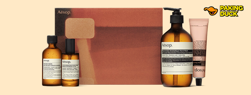
In a world where luxury beauty brands compete with glittering packaging and ornate designs, Aesop has mastered the art of standing out by staying quiet. The Australian luxury skincare brand's signature amber bottles and minimalist labels have become an iconic example of how premium skincare packaging can whisper rather than shout, while still commanding attention in a crowded marketplace.
The Evolution of Aesop's Iconic Packaging Design
The story of Aesop's packaging design is intrinsically linked to the brand's founding philosophy. Since its inception in 1987, Aesop has consistently chosen substance over spectacle. Their iconic amber glass bottles weren't just an aesthetic choice – they represented a fundamental commitment to product integrity and sustainable luxury packaging.
The Science Behind the Amber Bottles
While many luxury beauty brands opt for clear glass or plastic containers, Aesop's choice of amber glass bottles serves a crucial practical purpose. These pharmaceutical-grade containers protect their natural formulations from UV degradation, extending product life without the need for additional artificial preservatives. This perfect marriage of form and function exemplifies how premium skincare packaging can prioritize product efficacy while maintaining aesthetic appeal.
Breaking Down the Elements of Aesop's Minimalist Design
Typography and Label Design
The genius of Aesop's packaging lies in its meticulous attention to detail:
- Carefully selected typefaces that prioritize legibility
- Strategic use of negative space
- Precise alignment and spacing that design schools now study
- Black text on white labels creating maximum contrast and readability
Material Selection
The brand's commitment to sustainable beauty packaging is evident in their material choices:
- Amber glass that's both protective and recyclable
- High-quality paper labels that age gracefully
- Minimal use of plastic components
- Packaging that's designed for potential reuse
The Impact on Luxury Beauty Industry Standards
Aesop's influence on minimalist beauty packaging design extends far beyond their own products. Their success has challenged traditional notions of luxury packaging, proving that:
Redefining Luxury Through Simplicity
The brand has successfully demonstrated that luxury doesn't need to equate to opulence. Their minimalist approach has influenced countless other brands, making sustainable luxury packaging a growing trend in the beauty industry.
Creating Brand Recognition Through Consistency
Aesop's packaging design has achieved something remarkable: instant recognition through consistency. Their amber bottles with black-and-white labels are immediately identifiable, proving that strong brand identity doesn't require flashy designs or complex color schemes.
Sustainability Meets Premium Design
In an era where environmental consciousness is paramount, Aesop's packaging choices resonate deeply with environmentally conscious consumers. Their approach to premium skincare packaging demonstrates how brands can balance luxury with responsibility.
Environmental Impact
The brand's packaging choices reflect a commitment to sustainability:
- Recyclable materials
- Minimal excess packaging
- Durability that extends product lifecycle
- Reusable containers that reduce waste
Consumer Response
Modern consumers increasingly appreciate brands that prioritize sustainable beauty packaging. Aesop's approach has helped position them as a forward-thinking luxury brand that understands contemporary values.
The Future of Luxury Packaging Design
Aesop's success has implications for the future of packaging design in the luxury sector. Their minimalist approach has shown that:
- Simplicity can be more impactful than complexity
- Functionality doesn't have to compromise aesthetics
- Sustainable practices can enhance brand value
- Consistent design language builds strong brand recognition
Lessons for Modern Brands
The Aesop packaging story offers valuable insights for brands looking to develop their own premium skincare packaging:
1. Prioritize purpose over decoration
2. Invest in quality materials that protect products
3. Maintain consistent design language
4. Consider environmental impact
5. Focus on user experience
Innovation Through Restraint
Perhaps the most remarkable aspect of Aesop's packaging design is how it continues to feel modern and relevant decades after its introduction. By choosing timeless design over trending aesthetics, they've created packaging that ages as gracefully as their products.
Looking Beyond the Surface
Aesop's packaging design success isn't just about aesthetics – it's about creating a complete brand experience that aligns with their values and resonates with their target audience. Their amber bottles and minimalist labels have become more than just containers; they're a statement about what modern luxury can be.
Conclusion
In a market saturated with excess, Aesop's quiet luxury stands as a testament to the power of thoughtful design. Their packaging demonstrates that true luxury doesn't need to announce itself – it can simply be, confident in its purpose and execution.